

AAP says it’s “false”. The numbers say otherwise.
Fact-check by a real Australian patriot
Written by Flynn Holman, find more of his content on 𝕏 @Flynn_Holman_
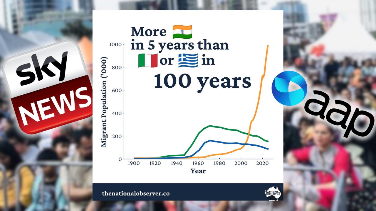
Over recent weeks, a simple but powerful claim has gained attention in Australia’s migration debate: that there are “more Indians in five years than Italians and Greeks in 100.” The statement was heavily circulated by the March for Australia organisers, and I published a graphic on X illustrating the rapid growth of the Indian-born population compared with the European migration waves that followed the Second World War.

The claim quickly went viral. It was repeated at the nationwide ‘March for Australia’ rallies on August 31, featured prominently in speeches and materials, and since then has been widely discussed in both Australian and international media. Its traction reflects a growing unease about the unprecedented scale of migration that is reshaping our country.

Yet almost as soon as the claim entered the public conversation, it was targeted by a “fact check” from the Australian Associated Press (AAP). In his article March for Australia group's claim about Indian migrant numbers is false, reporter Matthew Elmas sought to discredit the claim outright. His piece uses the word “false” at least seven times, as though sheer repetition could make the argument convincing. But when one looks closely, the AAP fact check relies on a single cherry-picked dataset and one interview with Professor Alan Gamlen of the Australian National University - whose name, tellingly, the article manages to misspell. This is not careful analysis. It is pro-migration spin dressed up as fact-checking. And it reflects a broader pattern: rather than addressing genuine concerns about migration levels with honesty and transparency, critics are dismissed and accused of spreading “falsehoods.”
When the full range of migration data is properly examined, it becomes clear that the claim is not only defensible, but accurate. Indian migration in recent years dwarfs anything seen in Australia’s modern history, both in absolute numbers and on a per capita basis.
Why the Claim Matters
Before delving into the numbers, it’s worth asking why this claim so contested. The answer lies in the role of migration in Australian identity. Policymakers and media commentators often invoke the “nation of migrants” story to defend high migration intakes, pointing to post-war Italian and Greek arrivals as a precedent. This narrative is used to reassure the public that what is happening today is nothing new, just another chapter in the multicultural story. Not only that, but it is also essential to our function as a nation. If today’s migration wave is qualitatively and quantitatively different, that narrative falls apart. The AAP’s eagerness to dismiss uncomfortable comparisons reveals how politically sensitive the issue has become.
The Population Evidence
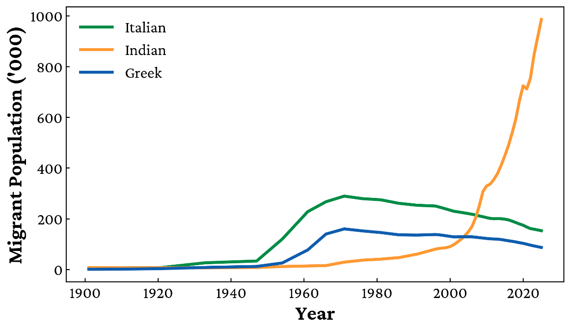
Let’s start with the simplest measure: the number of migrants actually living in Australia. According to the 2021 Census, there were 712,040 Indian-born residents. By 2025, projections put that number close to one million. That is a staggering increase in just a few years.
Compare this to the historical peaks of Italian and Greek migration. In 1971, the combined total of Italian- and Greek-born residents was 449,676. That figure has declined since, as these communities have aged and the migrant intake has slowed. At every point in the past five years, the number of Indian-born migrants in Australia has exceeded the maximum number of both Italians and Greeks ever recorded. That alone should settle the matter. But because AAP tries to redefine the debate around “net overseas migration,” let’s examine that too.
Net Overseas Migration: The AAP’s Cherry-Pick
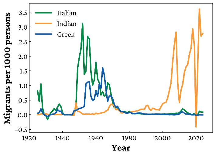
AAP bases its “false” verdict on net migration data from one specific five-year period: 2015/16 to 2019/20 (highlighted in blue below). During that window, the ABS records 279,450 net Indian arrivals, compared to 517,883 combined Greek and Italian arrivals between 1924 and 1971. This sounds damning, until you realise it is a cherry-pick. Why did they choose to end at 2019/20, just as Indian migration was accelerating? The choice is even more suspicious when you remember that 2019/20 was the first year hammered by COVID border closures. Migration numbers plummeted, not because demand fell, but because the government literally closed the gates. Using that year as the endpoint guarantees an artificially low figure. Either AAP’s author knew this and deliberately chose a window designed to mislead, or he failed to grasp the most basic fact about the dataset he was relying on. Neither explanation inspires confidence in the integrity of the “fact-check.”
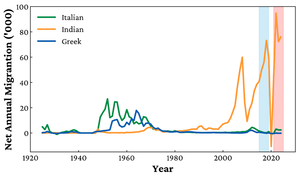
Once you look at the data beyond 2020 (shown in red), the picture changes dramatically. The post-COVID rebound has been extraordinary, with Indian migration levels three to five times higher, in raw terms, than anything seen during the European post-war boom. Far from being “false,” the claim reflects the reality AAP tried so hard to conceal.
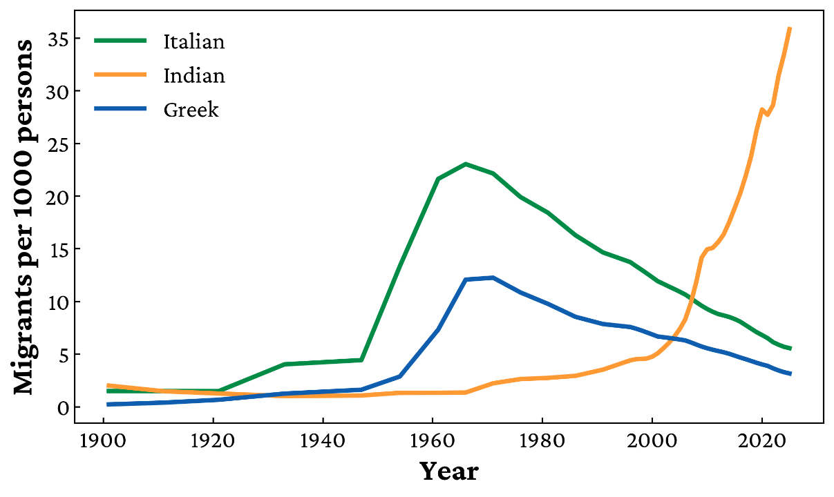
Moreover, the AAP notes that “The combined cumulative net migration (migrants arriving minus migrants departing) of Greek and Italian nationals between 1924 and 1971 alone was 517,883” implying that including a further 50 years of data would significantly increase this total. In fact, only 78,125 Italian and Greek migrants were added to that total between 1971 and 2025, giving a complete figure of 596,008 – 208,598 Greeks and 387,410 Italians – over the 100-year period to 2025.
The reality is that the ABS releases migration figures with significant lags, and the years after 2020 saw extraordinary increases in Indian arrivals. This lag hinders our ability to make topical and up to date commentary on the migration waves of today. The most recent available net overseas migration data is from the year to June 2024. Therefore the 5 years proceeding this still included the effects of Covid-19 which artificially decreased the migration numbers. There is, however, a clear trend in the number of net Indian arrivals from 2010 until today, as can be seen below in red.
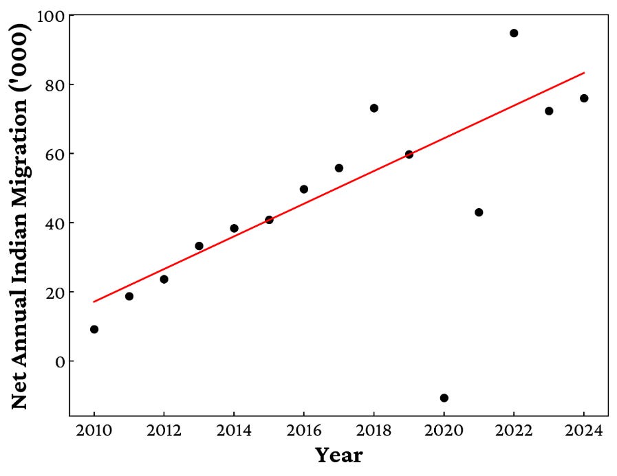
Taking this artificial decrease into account, the expected number of migrants in 2020 and 2021 would have been significantly higher. Combining those estimates with the actual data from 2022, 2023, and 2024, the five-year period to 2024 represents roughly 420,000 net Indian migrants. That total surpasses both the 208,598 Greeks and the 387,410 Italians who arrived in Australia between 1925 and 2025, and it is set to climb further once the ABS releases the 2024/25 figures.
So, when AAP says the claim is “false,” what it really means is that if you pick one narrow dataset, ignore later years, and exclude context, you can tell a different story. That’s not fact-checking. That’s narrative protection. Ironically, even the 279,450 figure which the AAP leaned on, covering 2015/16 to 2019/20, is itself higher than the entire Greek migration to Australia across the last 100 years. In some ways, that’s the most damning comparison of all. Over back-to-back five-year periods (2015/16–2019/20 and 2019/20–2023/24), net Indian migration dwarfs the total Greek intake of the past century twice over.
Per Capita: The Strongest Rebuttal
Even more compelling is the per capita evidence. In the AAP article, Professor Gamlen argued that migration should be judged relative to Australia’s population size at the time. On this point, I agree. But his conclusion, that post-war European migration was “much larger still”, is flatly wrong.
Using ABS population estimates, the annual net overseas migration data can be adjusted to directly show the relative size of the migration waves. Even with this change, Indian migration is at an equivalent or higher level than the Italian migration peak in the 1950s. The bar chart specifically highlights the 5 years with the highest net migration per 1000 persons in the Australian population.
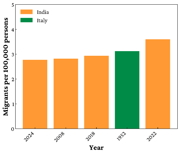
The key data from this representation is that:
In 2022, Indian migration reached 3.61 net arrivals per 1000 people, the highest per capita figure ever recorded in Australian history.
Four of the top five years for per capita migration since 1924 have involved Indians, all of them after 2008.
Italian migration in 1952 is the only European year that comes close, and it still ranks below India’s recent surge.
On a per capita basis, the so-called “great European migration wave” is eclipsed by today’s Indian intake. There is no evidence to support Gamlen’s claim that post-war European migration was “much larger still.” In fact, the cumulative per capita data also shows the opposite. While Italian and Greek populations grew steadily across a decade, peaking in 1971, the Indian-born population has been expanding exponentially since 1980, with no sign of slowing. In every year since 1900, the past five years of the Indian migrant population have outstripped both Italians and Greeks as a share of the Australian population.
Why AAP’s Approach is Misleading
Fact-checking is supposed to clarify public debate, not distort it. By selectively quoting one figure, ignoring more recent context and data, and labelling the claim “false” with such force, AAP undermines trust in the very idea of fact-checking. People can see the Indian community growing rapidly around them. Census data confirms it. The number of protestors at the March for Australia confirms it. Yet the fact-checkers tell them it’s “false.” That creates dissonance and feeds the perception that the media is gaslighting ordinary Australians.
Moreover, by downplaying migration’s scale, the fact-check shields policymakers from accountability. High migration has enormous impacts: on housing affordability, infrastructure, wages, and social cohesion as we have discussed many times at the National Observer. Australians are entitled to a fair debate, grounded in the full evidence, not massaged numbers designed to shut it down.
Conclusion: Fact or Spin?
Let’s return to the original claim: that there are “more Indians in five years than Italians and Greeks in 100.” Look at the population figures. Look at the net migration. Look at the per capita data. On every measure, the statement holds true. What AAP calls “false” is, in fact, supported by the numbers.
It is also misleading to equate the post-war European arrivals with today’s flows. The Italians and Greeks came in a very different economic and social context. Their migration was largely permanent settlement, at a time when Australia actively recruited European labour for reconstruction and industry. By contrast, much of the Indian intake is temporary or semi-permanent: student visas, ‘skilled’ workers, who later convert to permanent residency.
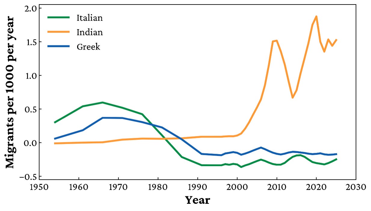
The final graph shows the trend clearly: when averaged across five-year spans, Italian and Greek migration rarely exceeded 0.5 arrivals per 1,000 Australians per year. Indian migration today runs at three times that level, 1.5 to 2 per 1,000 annually. The churn is higher, the numbers are bigger, and the rate of growth is far faster. Saying “we’ve seen it all before” is not only wrong, but it also erases the unique scale and nature of what is unfolding now.
It is time we faced the facts. Indian migration is unprecedented in both scale and pace. Pretending otherwise is not journalism. It is political cover. Political cover to hide this reality until it is too late to do anything about it. It is clear the Australian public won’t stand for this and if the reality they know is true is continually ignored by the political elite, the rallies we saw on August 31 will only be the start of the political storm to come.
